My latest novel, “Sudden Rescue” was released on the Ides of March, and now that’s it’s been flung out into the cold, hard world of the marketplace, it’s too late to make any significant changes to it. That means we can talk about a few of the decisions that went into the book.
To catch you up on the premise, this is a light romp featuring a space trucker who winds up with a space princess falling into his lap. The whole galaxy is searching for the missing princess, and the two don’t know who to trust. The marriage of the princess would have sealed the only alliance capable of resisting the dread robot empire. Now, pursued across the galaxy by agents of the known empire, space pirates, and God knows who else, they have to find the one man that take them to safety.
The very first question asked by a potential reader was, “Do you describe the design of the robot places in an alien like fashion? because places were sentient machines live should not be made for human’s comfort of living.”
Great question. The short answer is yes. Ships manned by agents of the robot empire, the Syntharchy, can accelerate and maneuver in ways human ships cannot. The robots don’t have the same g-force limitations, and this gives them an advantage. It’s clear in the brief glimpse we get of the ships designed for Syntharchy use that they are not designed for human use. Not of all them are like that, though. Considerable action is spent escaping from a Syntharchy prison ship – a sort of floating concentration camp used to process captured humans and drag them back to Syntharchy space for…well, that would be telling, wouldn’t it? I’ll say this – the machines have a reason for hunting down and slaughtering humans. The point is that, when the action takes place on a Syntharchy ship that has lights and atmosphere and running water, it’s because the Syntharchy ship is used to transport living humans.
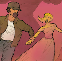
The big thing I wanted to talk about are all of the decisions that went into the design of the cover. Some choices are obvious. The sci-fi font for the title signals the setting. The slashing use of italics signals fast moving action. The hero, the threat, and the stakes are all presented in crystal clear fashion.
A few people have commented that the cover – done by the excellent Rapha Pinheiro* – is garishly colored. Pulp Revolution, remember? That’s a deliberate design choice. It’s supposed to catch the eye and stand out from the crowd. Even if people stop and think, “Well, that’s a really bright color,” at least they stopped and thought. Sometimes that half an extra second is all the bait you need to set the hook.
 |
| This is more important than you may realize. |
Do you see how the hero is grasping the space princess’s wrist and pulling her to safety? That tells you exactly what lies at the heart of this tale. You have a strong hero dragging a young and somewhat naïve young girl away from danger. She has gifts of her own, and shows traits that demonstrate she is worth rescuing, but at the novel’s beginning she doesn’t really understand that grand adventures aren’t like storybooks that one can simply put down when one is tired of them. Even with a far more sophisticated understanding of the political situation related to her disappearance, she still doesn’t quite grasp the seriousness of the situation.
Meanwhile, you’ve got an older and far more rugged hero, a blue collar guy determined to do the right thing, even if the woman he’s saddled with makes doing that right thing a lot more complicated than it needs to be. He’s a gentleman, not a mushy ‘friend’ who puts her on a pedestal, and he is not above manhandling if a good manhandling is what she needs at the time.
All of this is conveyed in one sweeping glance. Will that turn off a few readers? Yes, the right kind of readers. It will turn away readers who wouldn’t enjoy the story of an inadvertent knight in leather jacketed armor saving a princess from the clutches of evil. Which is fine by me – I’m not writing for those readers, I’m writing for readers who want a little romance with their action. I’m writing for readers who want heroes who step up and do the right thing for no other reason than because it’s the right thing to do. I’m writing for readers who want to see the guy get the girl in the end – even if the girl they get isn’t the girl they thought they wanted.
If you read and enjoy stories written in the same style as the golden age of science fiction, you’d probably also enjoy this series of novellas. These dragons are not misunderstood, they are pure destructive forces of nature than need putting down fast and hard.

